Brand Architecture: A Strategic Vision for Lehm Ton Erde
Non-implemented Case Study:
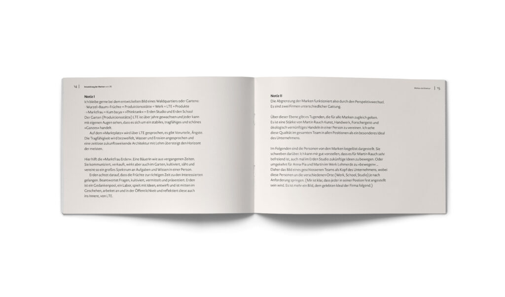
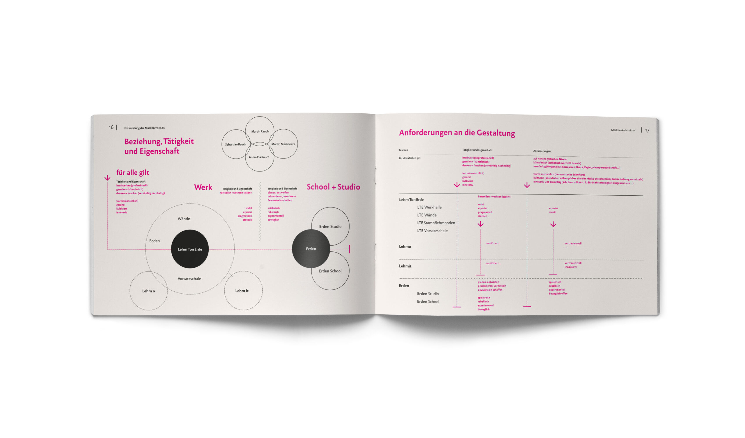
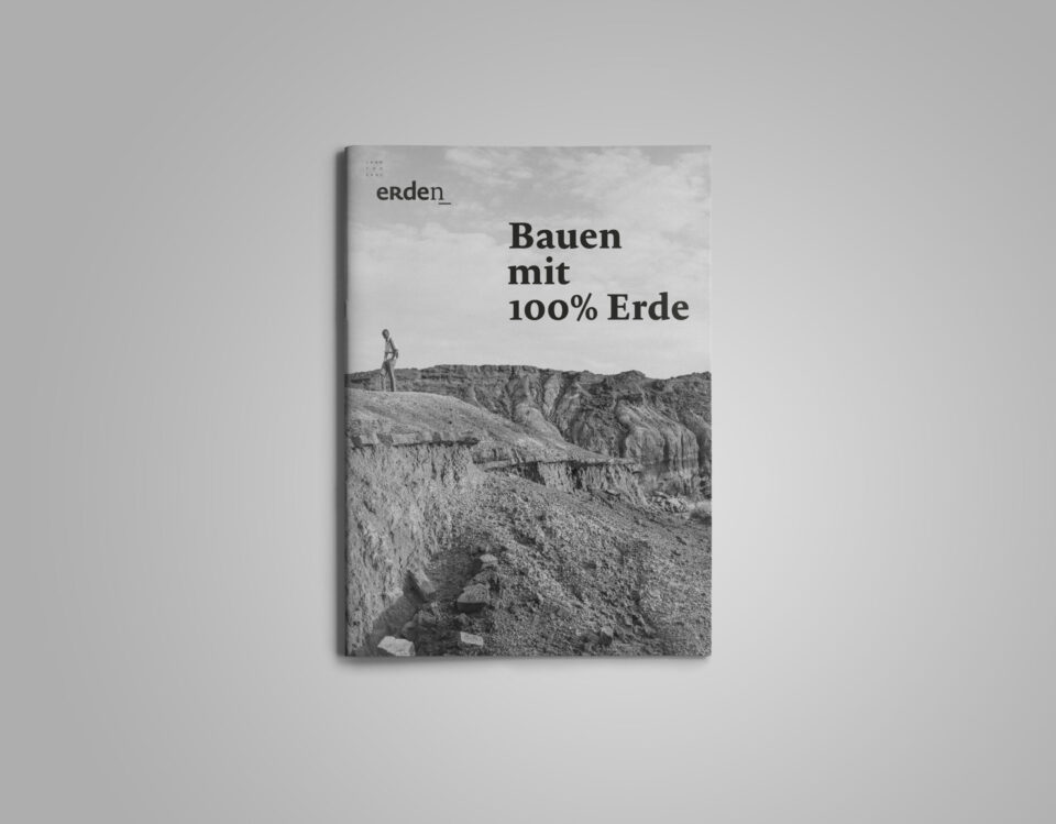
Developed in close collaboration with Martin Rauch and his executive team, this comprehensive manual is the result of an intense and rewarding creative exchange. It serves as a systemic study for the various ventures of the world-renowned rammed earth pioneer. I am grateful for the deep mutual trust during this process, which aimed to transform a decade-long growth of craftsmanship, production, research, and education into a clear, future-proof visual order—without losing the archaic power of the material.
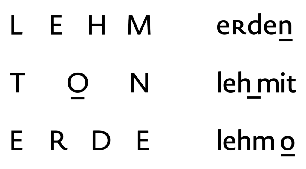
Tectonic Connections: A Conceptual Framework
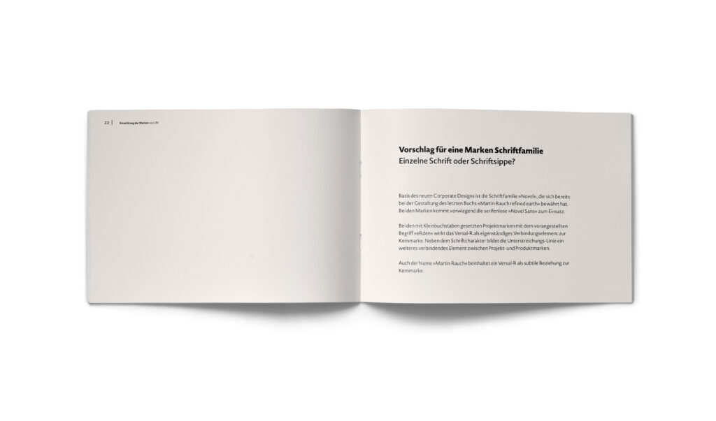
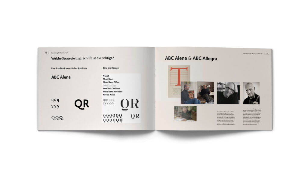
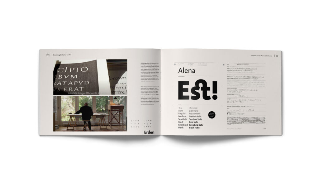
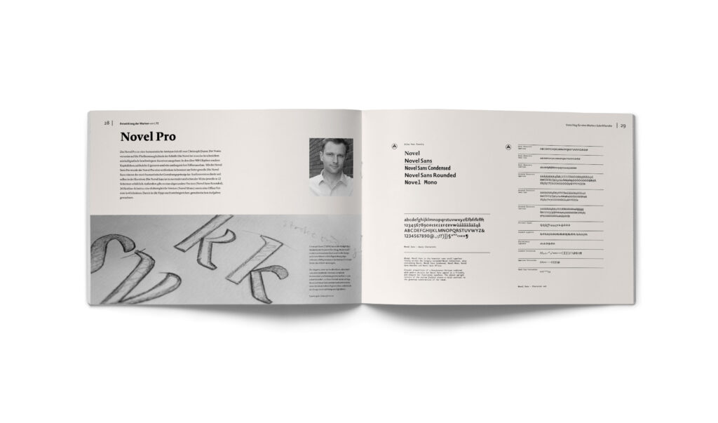
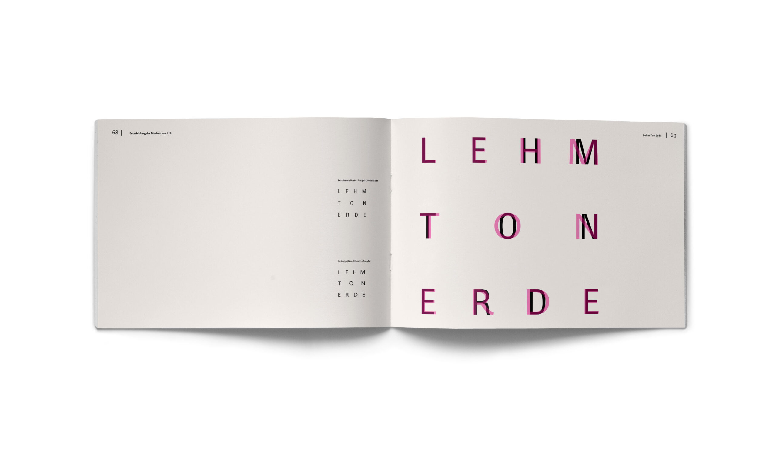
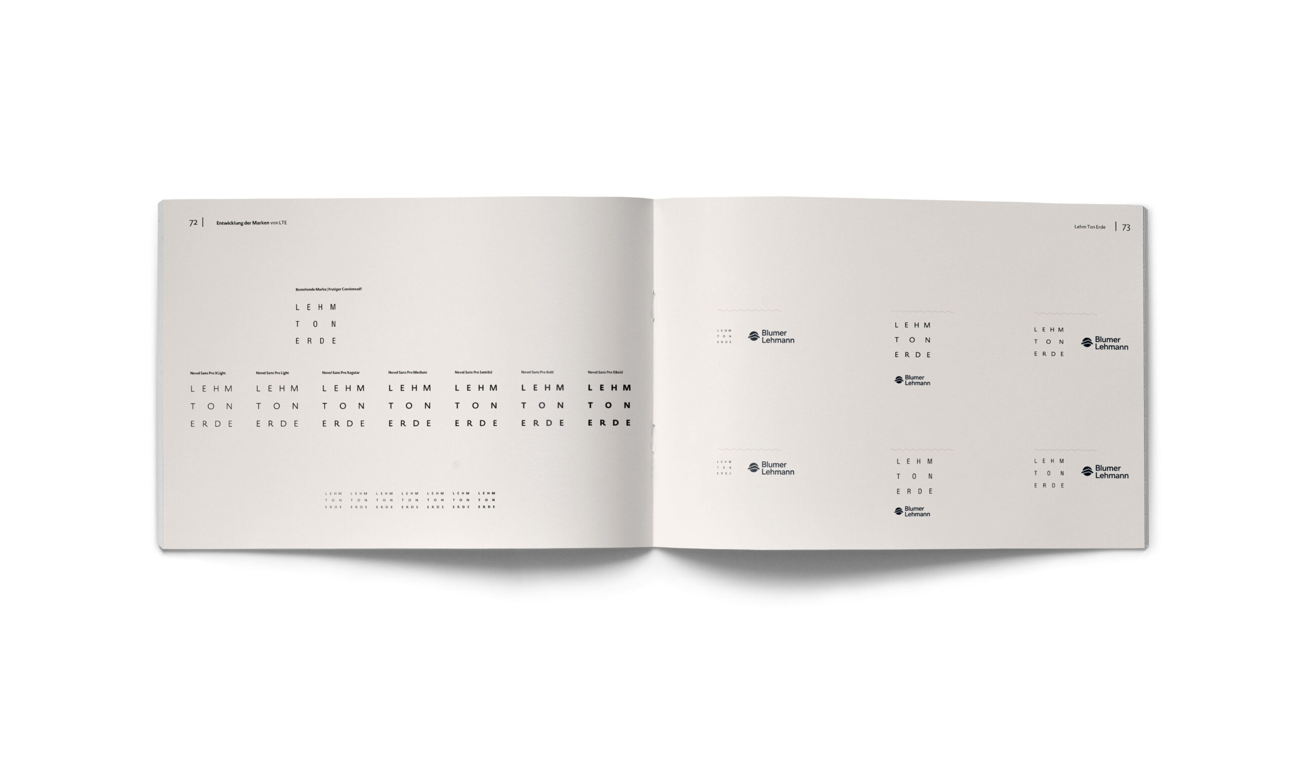
The visual identity is anchored by Christoph Dunst’s Novel Pro family—a humanist serif and sans-serif collection that balances poetic warmth with structural rigor. I chose the Novel as the perfect “sister” to rammed earth: both are archaically rooted, yet executed with extreme precision. Its calligraphic influence and extensive glyph set (including 900+ characters and multiple weights) provide the necessary flexibility for complex editorial tasks while reflecting the organic, humane essence of earth.
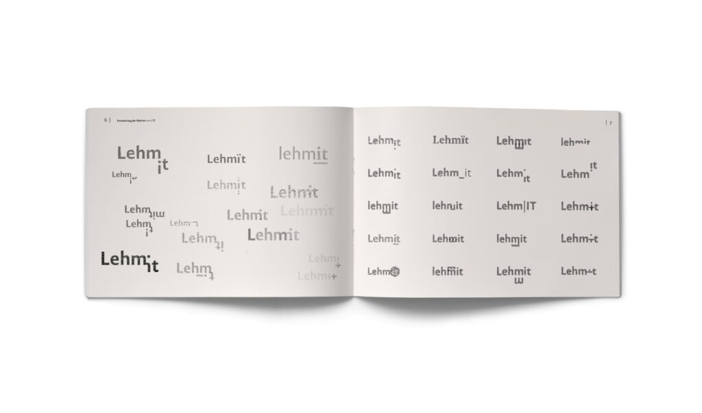
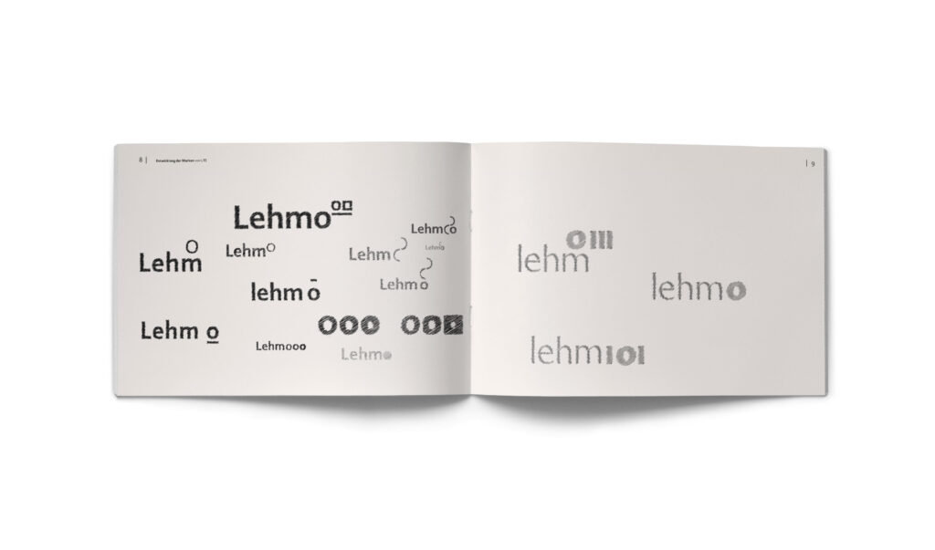
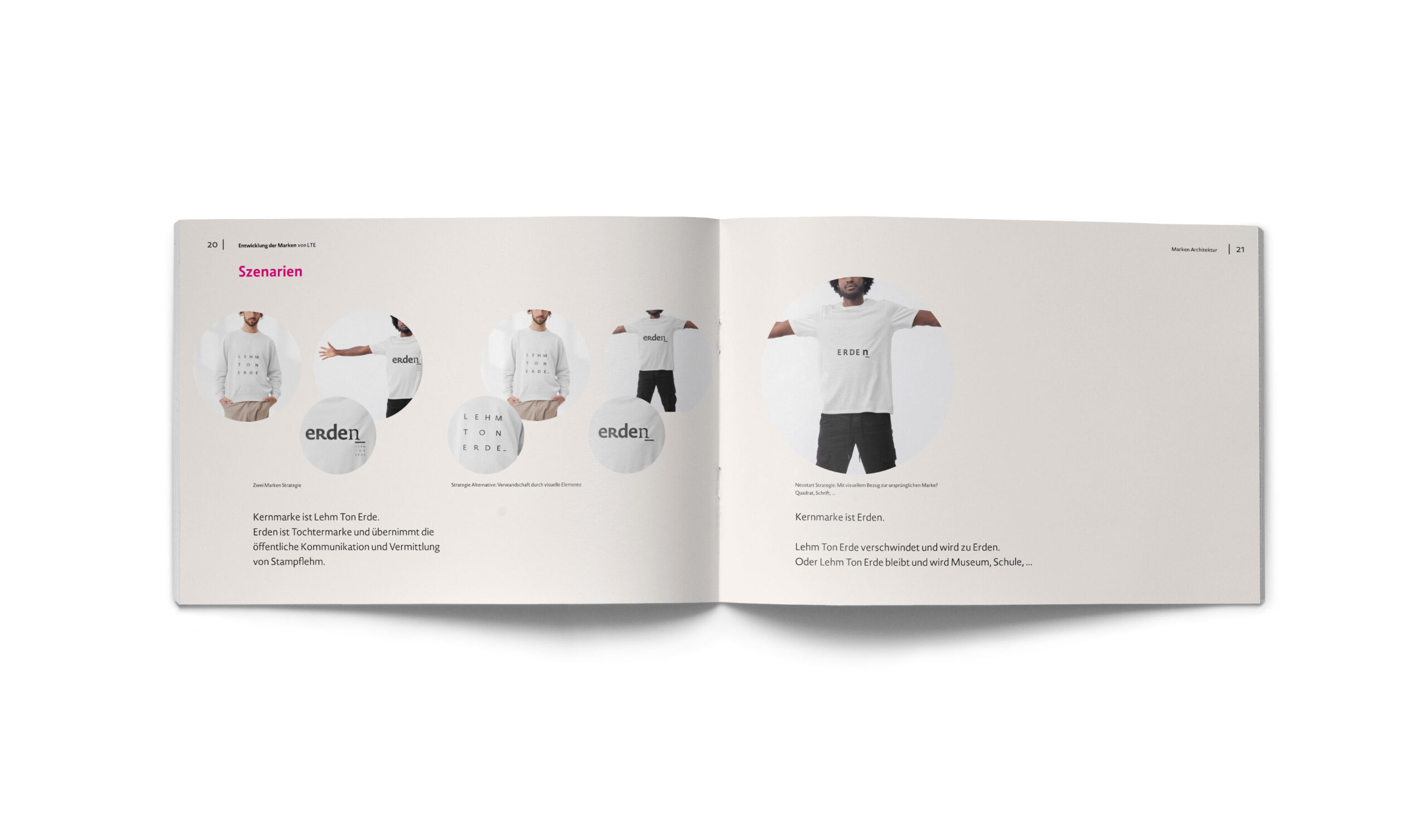
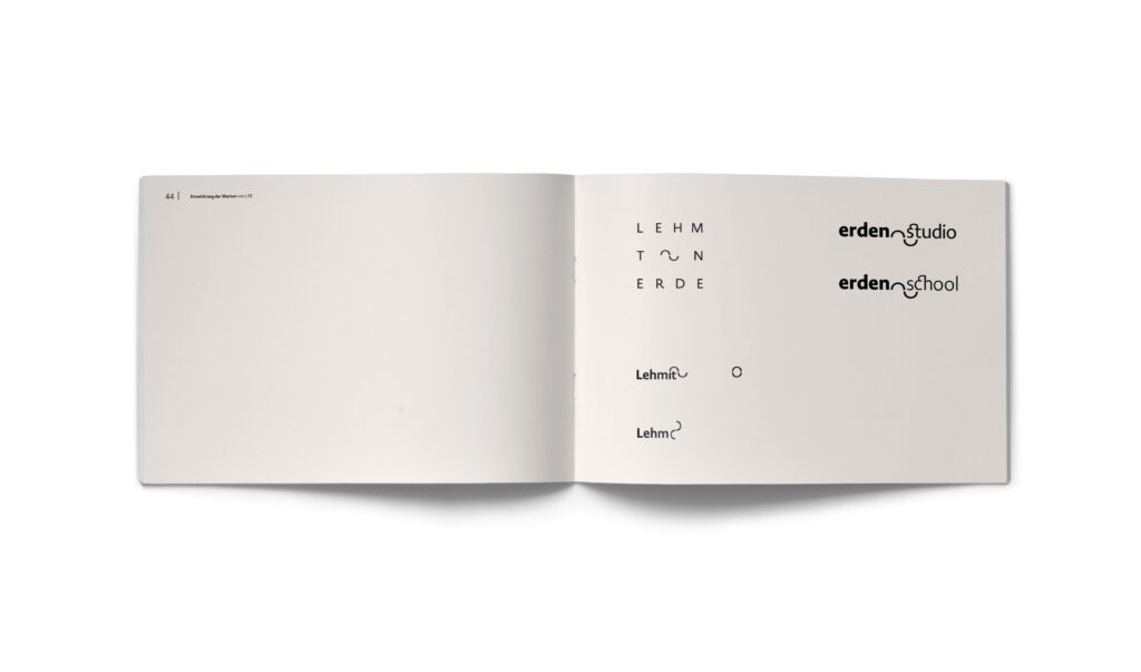
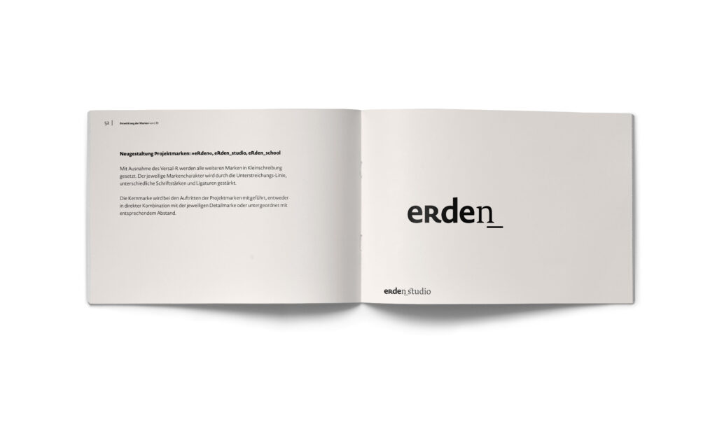
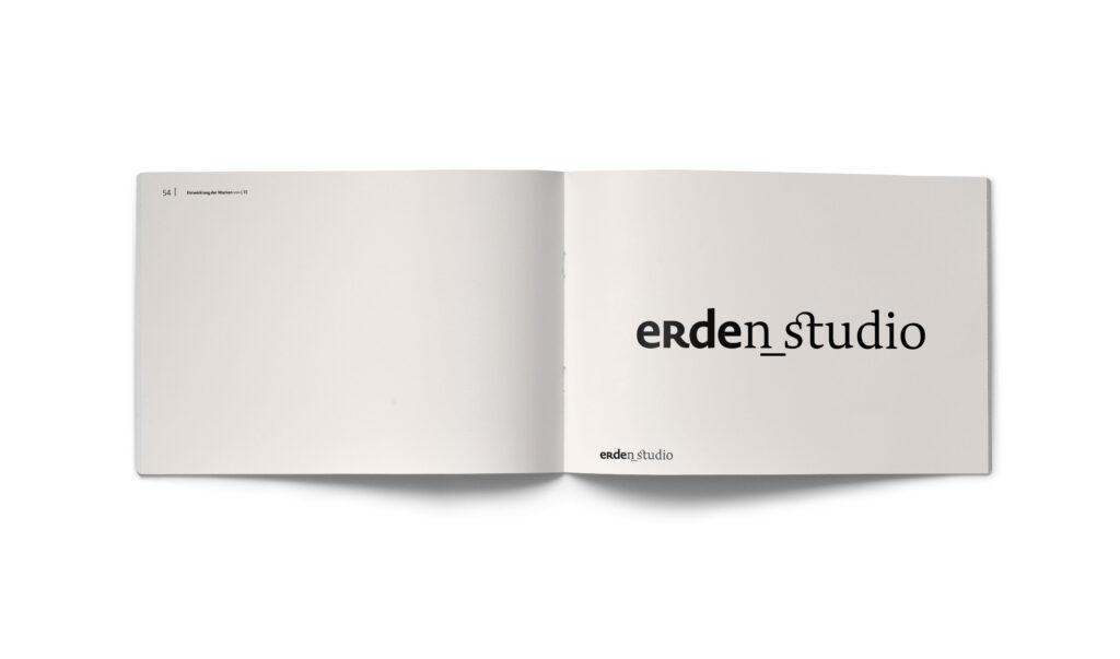
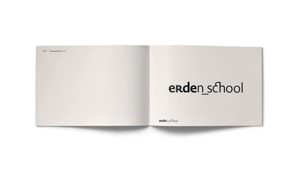
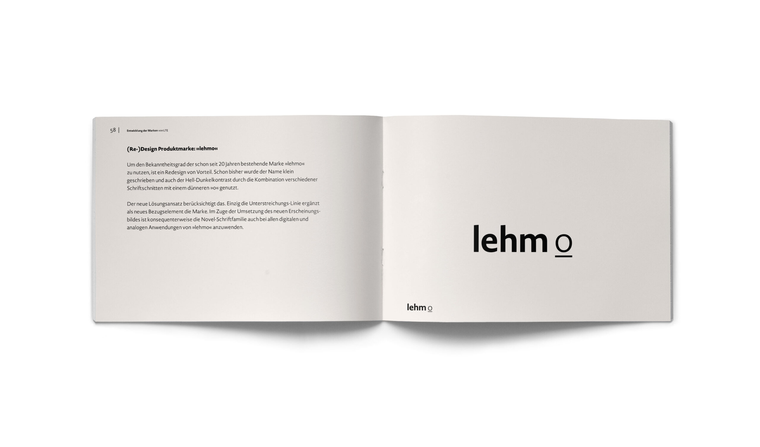
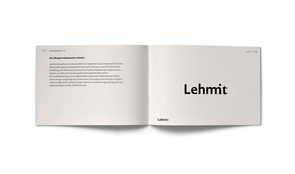
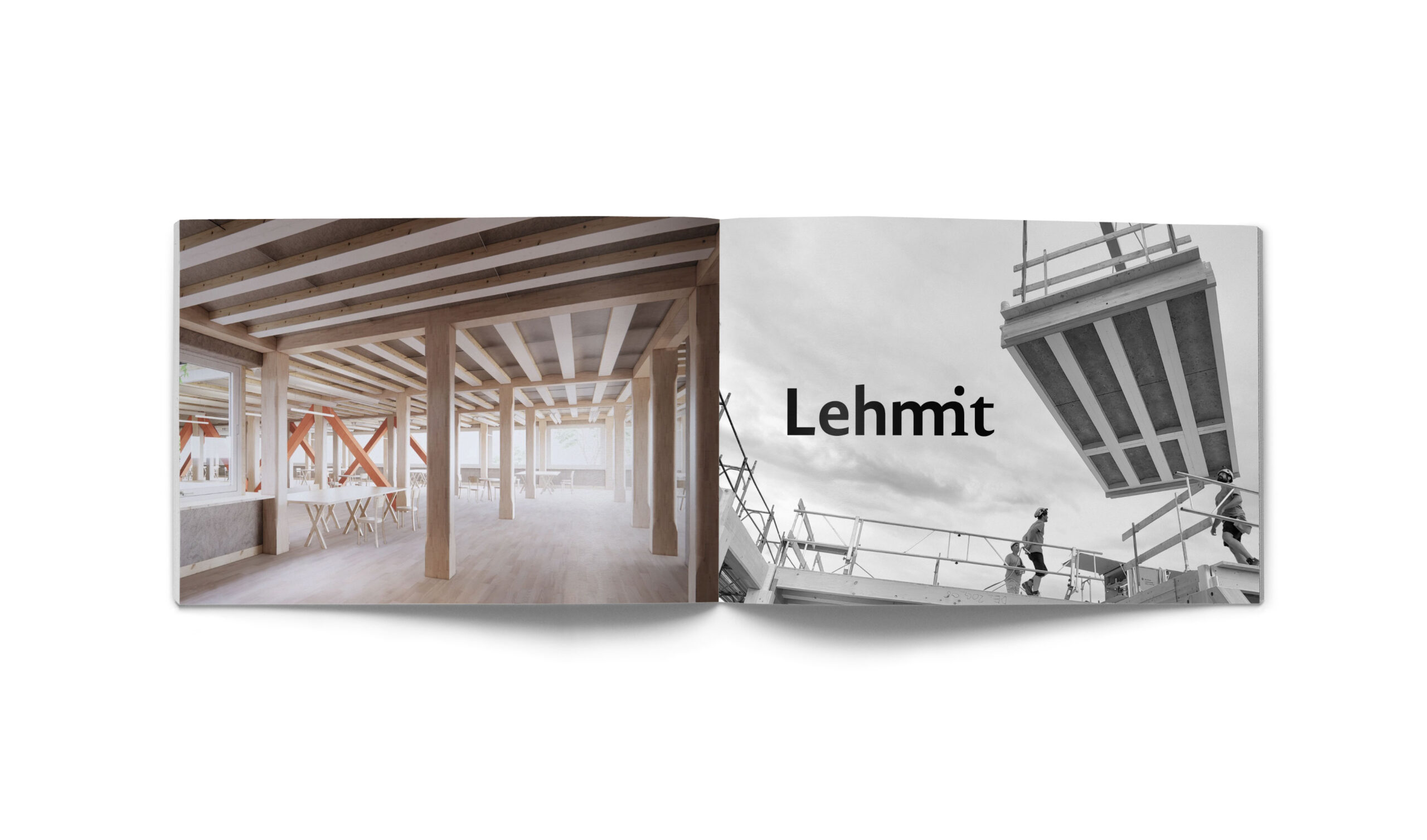
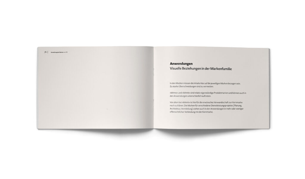
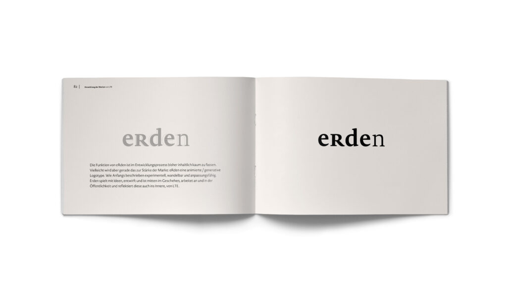
A prominent capital ‘R’ and a precisely placed underline form the tectonic connectors between the individual product brands, such as Lehmo and Lehmit, and the overarching master brand. In this system, the underline acts as the ultimate graphical ground—mirroring the very process of rammed earth: a horizontal compaction, layer by layer, anchoring the brand family firmly to its material foundation.
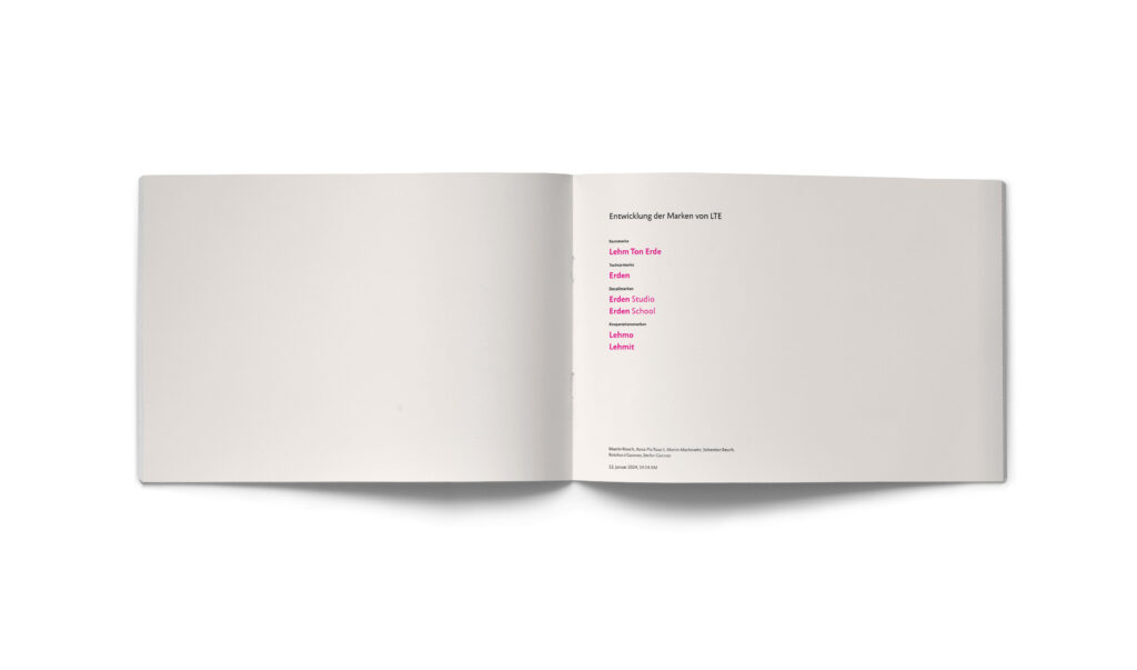
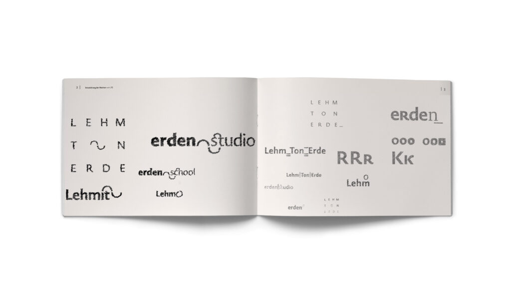
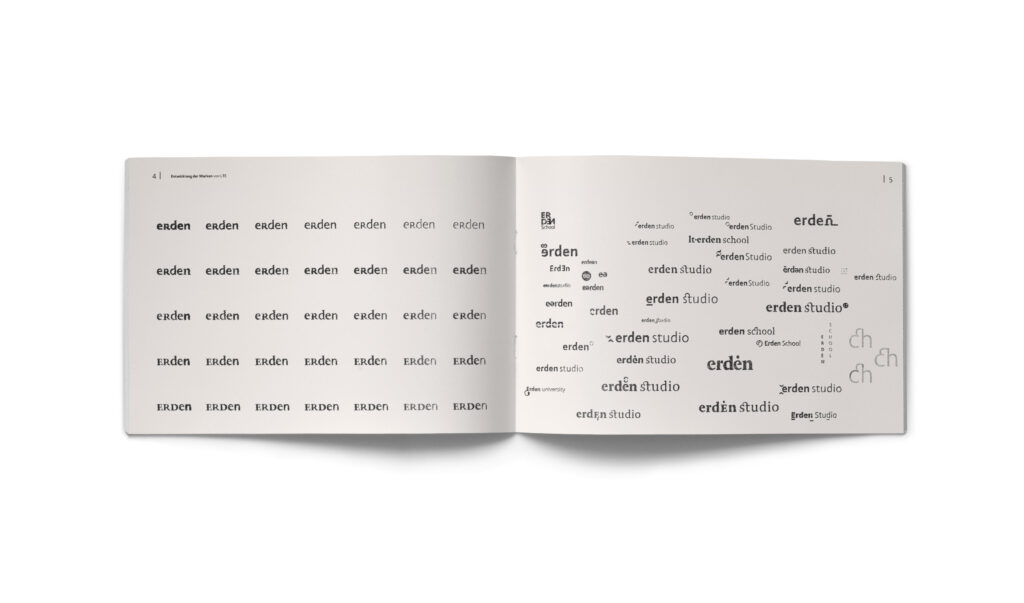
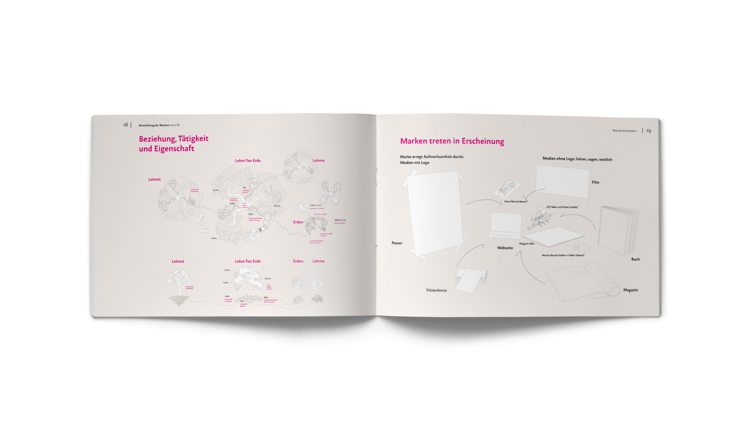
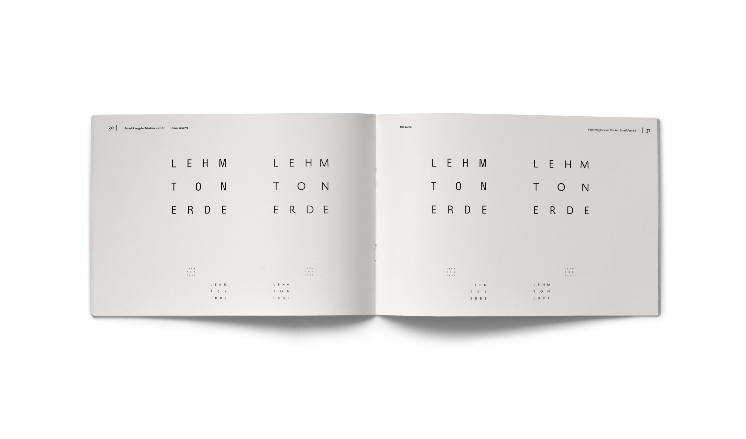
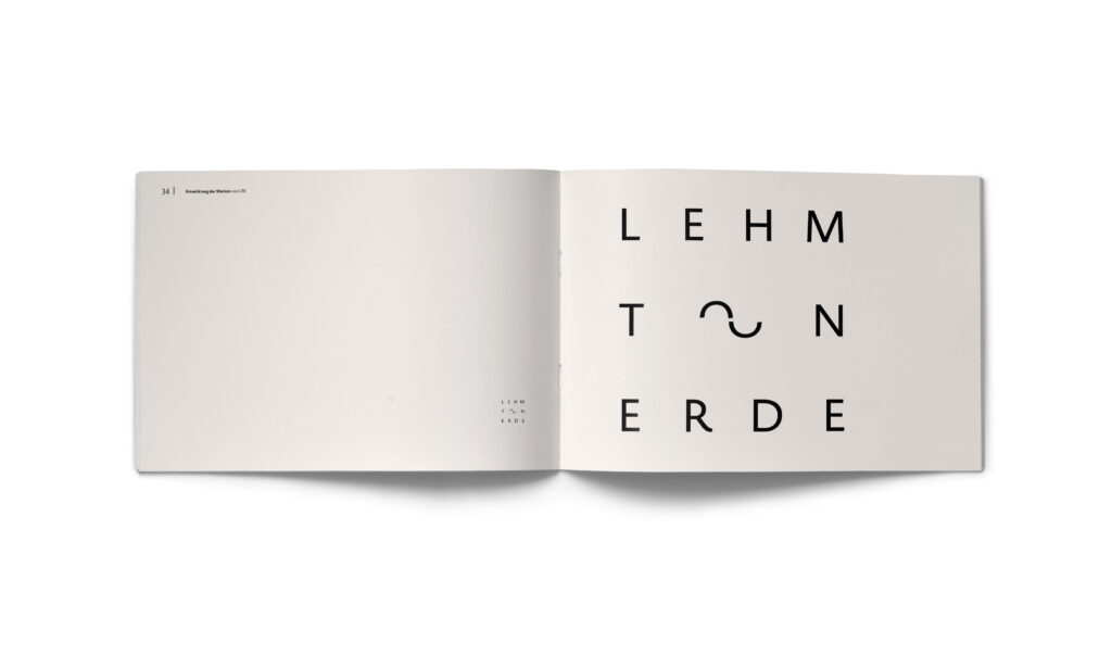
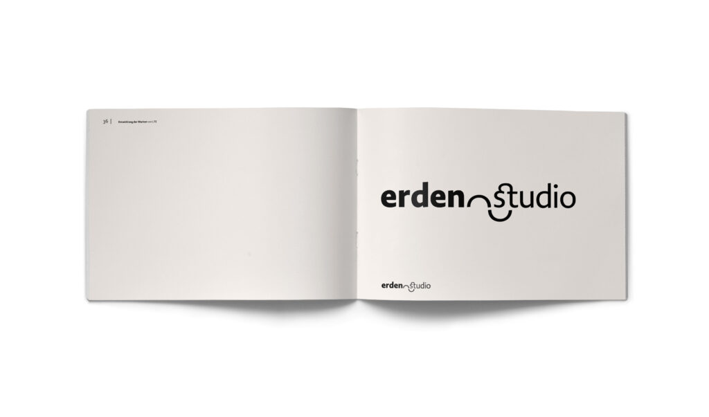
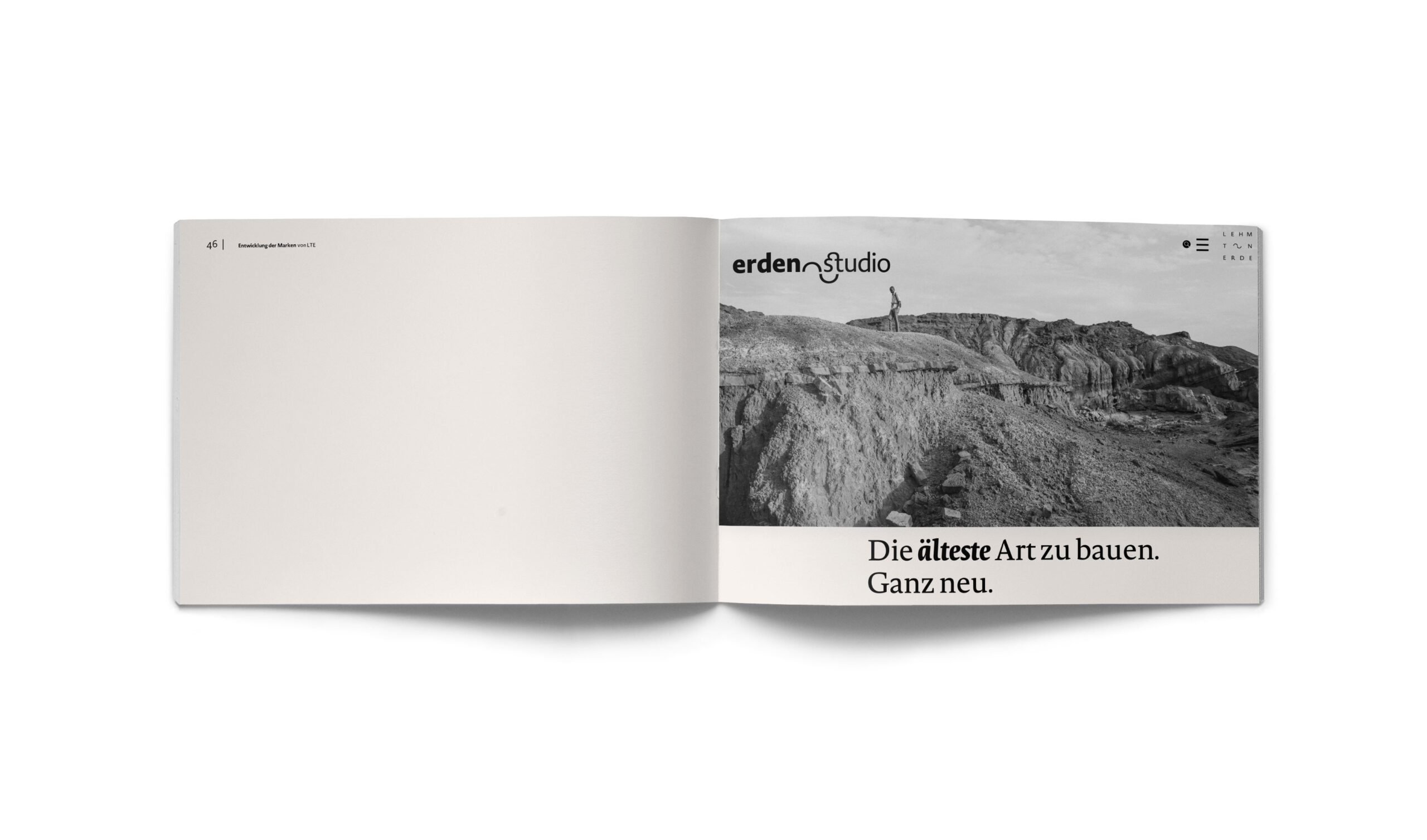
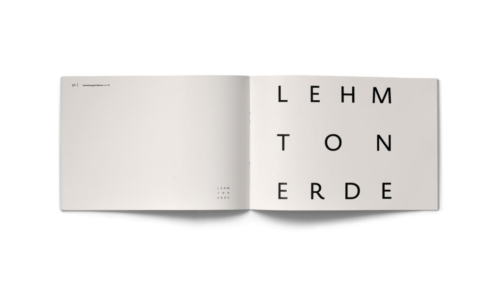
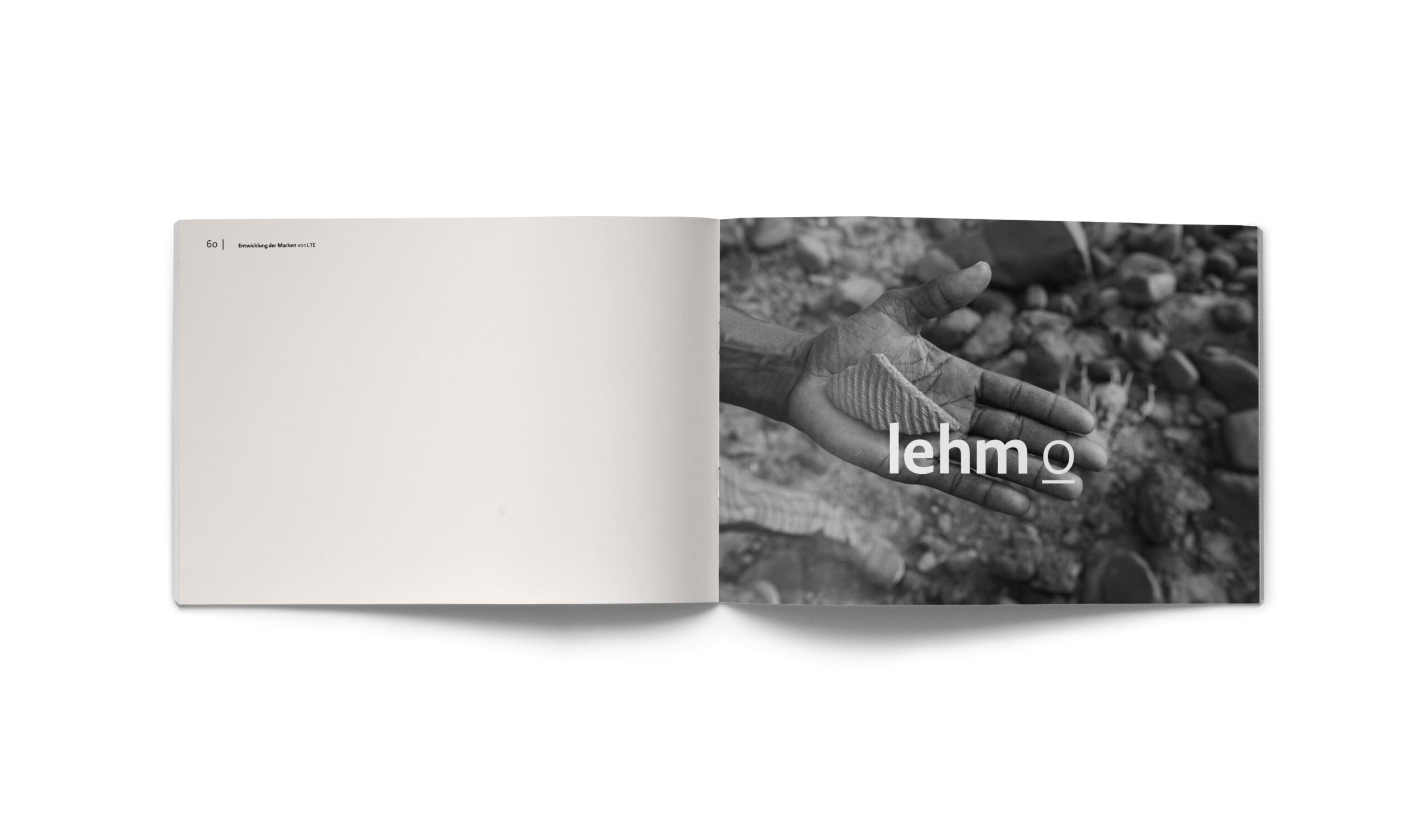
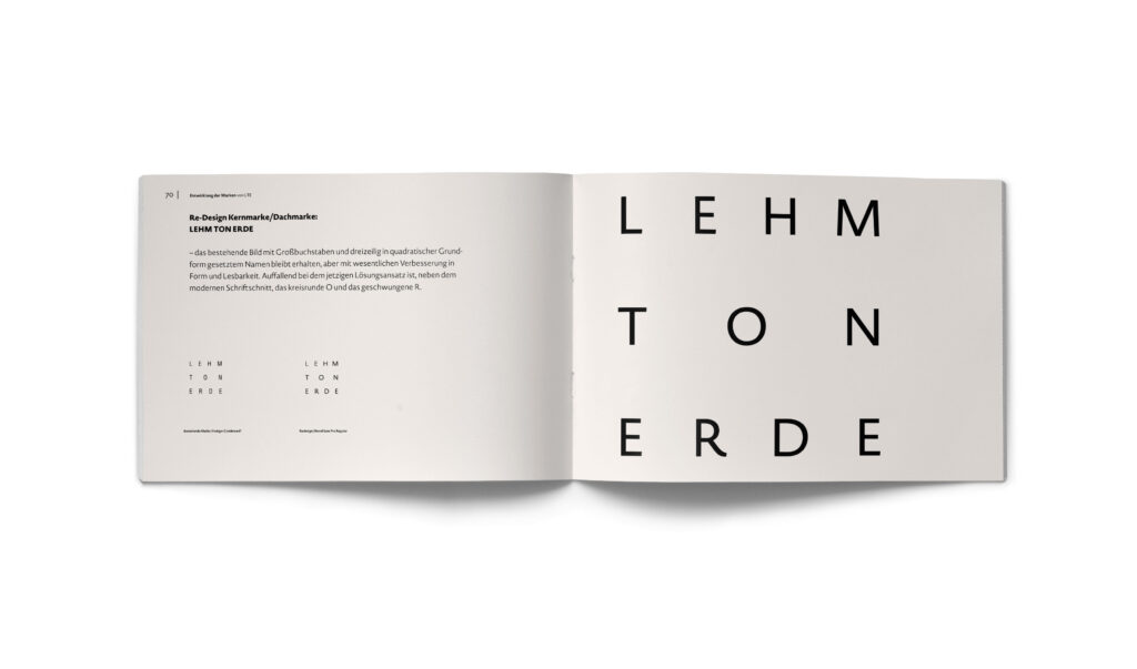
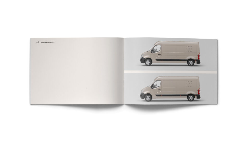
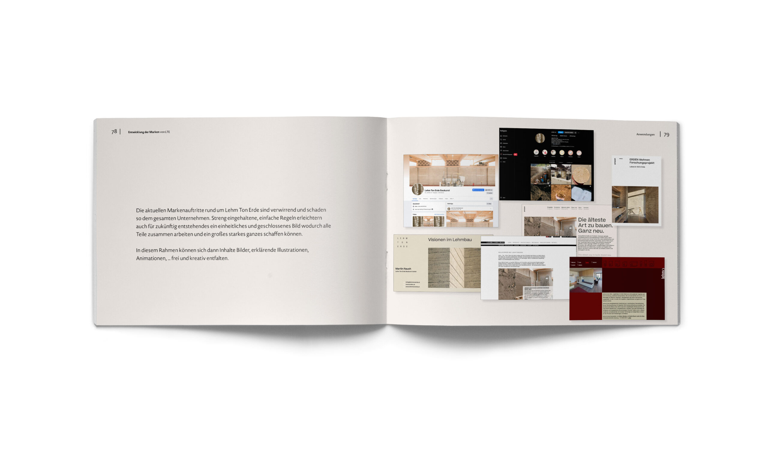
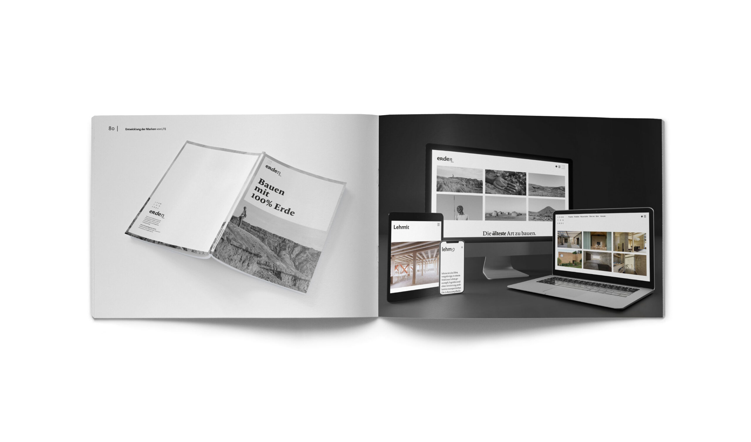
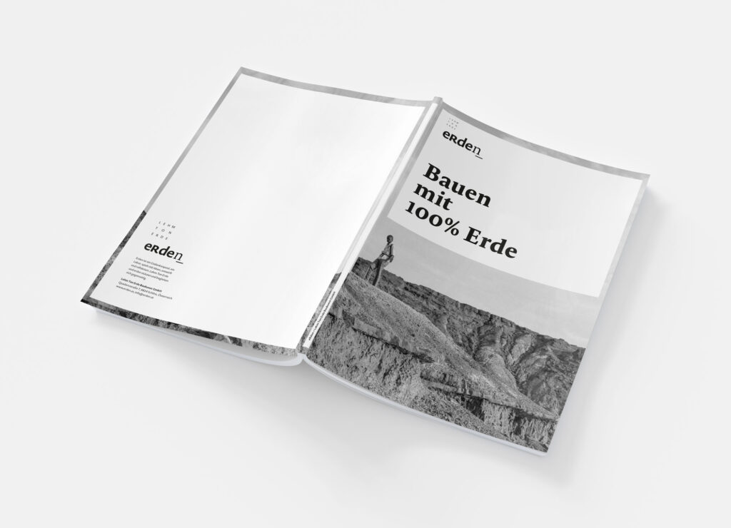
The following double pages present strategic concepts and mock-ups. They document the attempt to create a visual infrastructure that enables the company to present a strong, unified image. This study remains a testament to the potential of systemic design in sustainable architecture.