
Peter Zumthor – Dear To Me
Aber jetzt ein Fest!« — Peter Zumthor
The Architectural Manual:
Formatting the Tactile Rhythm of ‘Dear to Me’
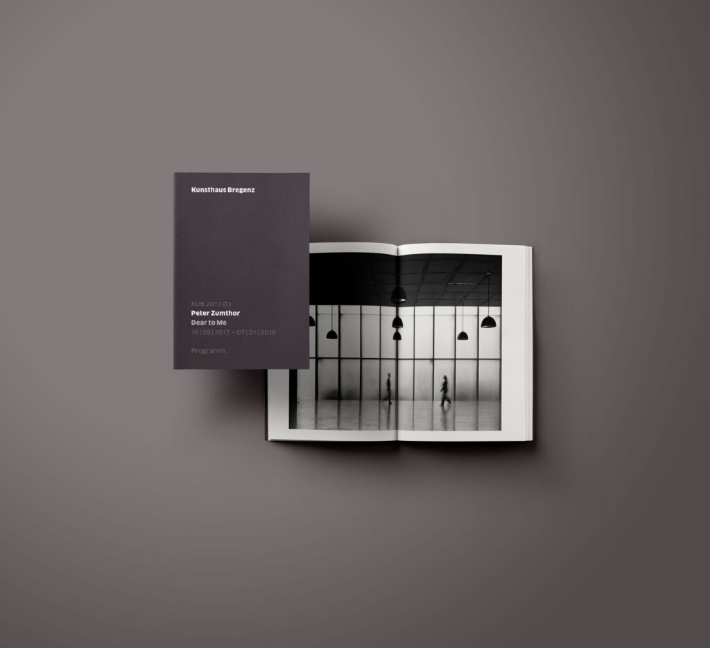
The official program booklet for Peter Zumthor’s anniversary exhibition at the Kunsthaus Bregenz was designed to serve both as a subtle physical guide and as a permanent archival record. Within Zumthor’s dense, sacred concrete atmosphere, the printed material had to function as an unyielding structural anchor. The choice of materials reflects the uncompromising character of the architecture. For the cover, the publication uses Remake (Midnight/Black), a revolutionary uncoated paper made from 25% upcycled leather by-products. This choice ensures a unique tactile response and excellent printing and finishing properties.
The layout’s grid system is calibrated to achieve maximum typographic density while maintaining strict margins for visual calm. Every column, line spacing, and font weight reflects the raw, geometric precision of the building’s concrete joints. It is a dense, rhythmic manifesto of editorial architecture—designed to be held in the hands, read, and kept.
Object: Institutional Program Guide
Materiality: Remake Midnight Paper (25% Leather Share)